![[Unity] UIElements Expansions: Responsive Grid - mathru.net | App Development with Flutter, Unity/Music and Video Production/Material Distribution](https://mathru.net/notion/cd2247d4-f078-4448-aeaa-f9bd2ae4a488/511700caa3517de4479c51324a604b75-large.webp)
UIElements Expansions is an extended asset for the Unity editor.
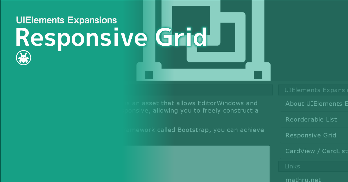
UIElements Expansions: Responsive Grid
"UIElements Expansions: Responsive Grid" strongly supports "UIElements" which was introduced with Unity 2019.1.
What is UIElements
UIElements replaces the current Unity editor GUI system (IMGUI) that was introduced in Unity 2019.1.
You can combine HTML for Unity "UXML" and style sheets for Unity "USS" to create a Unity GUI as if you were creating a web page with HTML and CSS.
Of course, you can write the process for the editor in the editor script as before, and you can create a dynamic GUI like HTML5 with methods like jQuery.
In the future, it is planned to replace the runtime GUI (Current uGUI) as well as the editor, and is expected to be the future Unity GUI.
However, the potential is high, but since it has just been introduced, there are still not enough functions to use it seriously.
"UIElements Expansions" is an asset that provides strong support for the missing pieces.
This "UIElements Expansions: Responsive Grid" mainly supports the following functions:
-
UIElements Expansions Common Features
- Global Style Sheet
- Inspector Auto Assign
- Additional Tags / Features
- Additional Class
- Responsive Style Sheet
- Bootstrap-Like Grid System
UIElements Expansions Common Features
Please refer to the following page.
Responsive Style Sheet

"UIElements Expansions: Responsive Grid" allows you to build responsive designs that switch to the best display for screen size, just like modern websites.
Click "Masamune/Demo/Responsive Grid Demo" from the Unity editor menu to display the Responsive Grid Demo window. Then try increasing the window size horizontally or vertically.
You will see the side menu of the window move.
This way, the display is optimized for the screen size.
You can specify the screen size and the USS file to be applied at that time by editing "EditorStyleInfo".
Bootstrap-Like Grid System

"UIElements Expansions: Responsive Grid" uses a grid system similar to "Bootstrap", one of the popular web design frameworks, to implement responsive structures.
"Bootstrap" divides the width into 12 grids, and determines the element's width by specifying how many of the horizontal grids you want to use in the class.
It's also responsive, so the grid lines up vertically as the screen size decreases. By listing 4 types, "xs", "sm", "md", and "lg", you can specify the screen size from which to arrange the images vertically.
Since "Bootstrap" is a widely used framework for Web design, there are many useful sites. For more information, search or visit the official website.
How to Use
Import

Purchase from Unity Asset Store.
You can import after purchase from "My Assets".
Responsive Style Sheet

You can use it as it is.
Set a new stylesheet
Open "Asset/Masamune/Modules/unit.style/Resources/EditorStyleInfo". "EditorStyleInfo" is a setting file for "Global Style Sheet", but you can set a responsive style sheet from "Style Sheets For Responsive" of "StyleSheet Settings".
Each item has the following settings:
-
Type
- You can set "Greater than or equal to" and "Less than"
-
Width
- You can set the width. Set the width range together with "Type" above.
-
Style Sheets
- Sets the stylesheet to apply only within the range set in "Type" and "Width" above.
For example, if you want to apply a stylesheet that changes color only to window sizes 500 or larger "Color.uss", set the following:
-
Type
- Greater Than
-
Width
- 500
-
Style Sheets
- Color.uss
Bootstrap-Like Grid System

It is basically the same as using the GridSystem of Bootstrap.
Basic Usage
Basically, you use the Div (VisualElement) tag and the "container" "row" class to write columns inside.
<engine:Div class="container">
  <engine:Div class="row">
    Columns
  </engine:Div>
</engine:Div>
Divide the width into 12 grids, and determine the actual width of the column based on how many of them you want to use.
For example, if you want to create three columns, write the following UXML:
| One of three columns | One of three columns | One of three columns |
<engine:Div class="container">
  <engine:Div class="row">
    <engine:Div class="col-4">
      <engine:Label text="One of three columns" />
    </engine:Div>
    <engine:Div class="col-4">
      <engine:Label text="One of three columns" />
    </engine:Div>
    <engine:Div class="col-4">
      <engine:Label text="One of three columns" />
    </engine:Div>
  </engine:Div>
</engine:Div>
In this case, 4 of the 12 grids are used, so [class="col-4"] is specified.
If you want to create two columns, write the following UXML:
| One of two columns | One of two columns |
<engine:Div class="container">
  <engine:Div class="row">
    <engine:Div class="col-6">
      <engine:Label text="One of two columns" />
    </engine:Div>
    <engine:Div class="col-6">
      <engine:Label text="One of two columns" />
    </engine:Div>
  </engine:Div>
</engine:Div>
In this case, 6 of the 12 grids are used, so [class="col-6"] is specified.
Grid Options
You can make it responsive by using the Grid option. Responsive support optimizes the grid for the display of inspector and editor windows, even if the screen size is reduced.
Specify each class name for the column element for the maximum width below.
When the window size is smaller than the maximum width, the width of the columns fills the width of the window and the columns are arranged vertically.
| ExtraSmall | Small | Medium | Large | |
| Max Width | None | 420 | 680 | 970 |
| Class Name | .col-* | .col-sm-* | .col-md-* | .col-lg-* |
Summary
"UIElements Expansions: Responsive Grid" strongly supports "UIElements" which was introduced with Unity 2019.1. In particular, it makes it easier to write inspector designs that previously required editor scripts.
The design structure can also be responsive to the screen size, even if the screen size changes.
The design has been flattened to match Unity 2019.3, which is cool at once, so you can use it comfortably.
If you are interested, please check out the asset store!