UIElements Expansions is an extended asset for the Unity editor.
UIElements Expansions: CardView / CardList
"UIElements Expansions: CardView / CardList" strongly supports "UIElements" which was introduced with Unity 2019.1.
What is UIElements
UIElements replaces the current Unity editor GUI system (IMGUI) that was introduced in Unity 2019.1.
You can combine HTML for Unity "UXML" and style sheets for Unity "USS" to create a Unity GUI as if you were creating a web page with HTML and CSS.
Of course, you can write the process for the editor in the editor script as before, and you can create a dynamic GUI like HTML5 with methods like jQuery.
In the future, it is planned to replace the runtime GUI (Current uGUI) as well as the editor, and is expected to be the future Unity GUI.
However, the potential is high, but since it has just been introduced, there are still not enough functions to use it seriously.
"UIElements Expansions" is an asset that provides strong support for the missing pieces.
This "UIElements Expansions: CardView / CardList" mainly supports the following functions:
-
UIElements Expansions Common Features
- Global Style Sheet
- Inspector Auto Assign
- Additional Tags / Features
- Additional Class
- CardView
- CardList
- Responsive Design
UIElements Expansions Common Features
Please refer to the following page.
CardView

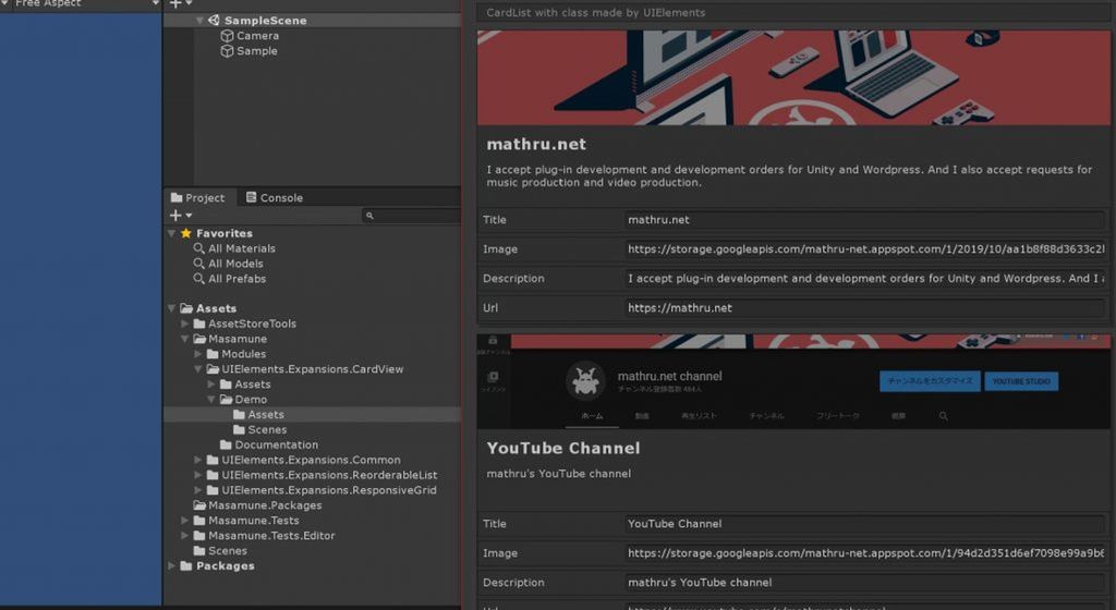
You can place a card-type design widget in the Unity editor's inspector or editor window.
Like Div and VisualElement, you can write a UXML tag inside the card, so you can use the widget in many ways.
Post-click actions can also be described and can act like buttons.
By using the template function of UXML, the external template can be used directly for the internal design of the card widget.
CardList

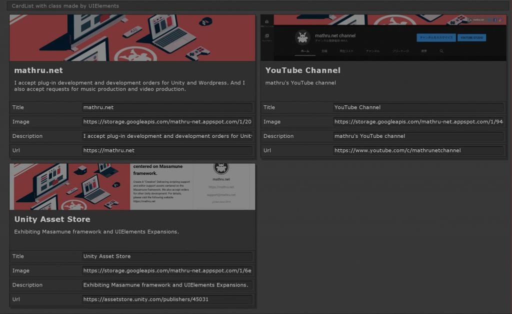
By specifying a serialized List or array to "binding-path", a Card List of the number of elements inside the serialized List or array is automatically generated.
Using a custom class for a List or an array element automatically binds the value of each element to each card, thus providing a different representation of the List/array than ListView or ReorderableList.
It can also be used in conjunction with an additional tag in UIElements Expansions, such as "BindableImage" "BindableLabel", to visually present bound values as-is. It can also be used in conjunction with "PropertyField" to set individual values within the card.
As with CardView, you can use "Button Processing" or "Template function".
Responsive Design

"UIElements Expansions: CardView / CardList" includes the responsive functions used in " " as standard.
You can feel the effect especially with CardList.
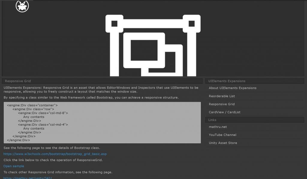
Using a Bootstrap-like grid system, you can specify how many windows should be lined up horizontally when the window size is large, and the vertical and structure will change automatically when the window size is reduced.
How to Use
Import

Purchase from Unity Asset Store.
You can import after purchase from "My Assets".
CardView
It can be used by writing UXML tags. There are 2 ways to use it: "Direct description of contents" and "Use Template".
Direct description of contents
Create CardView with the UXML tag inside the "editor:Card" tag as shown below.
<editor:Card>
  <editor:Image class="image" src="https://storage.googleapis.com/media.mathru.net/1/1bcdffd502f7e496966b76f63e8d738c.png" />
  <engine:H2 text="CardView" />
  <engine:Label text="CardView made by UIElements" />
</editor:Card>
Use Template
You can specify the contents of the card using the UXML template system as shown below.
<engine:Template path="Assets/Masamune/UIElements.Expansions.CardView/Assets/Styles/CardItem.uxml" name="Card"/>
<editor:Card template="Card" />// CardItem.uxml
<?xml version="1.0" encoding="utf-8"?>
<engine:UXML
xmlns:xsi="http://www.w3.org/2001/XMLSchema-instance"
xmlns:engine="UnityEngine.UIElements"
xmlns:editor="UnityEditor.UIElements"
xsi:noNamespaceSchemaLocation="../../../../UIElementsSchema/UIElements.xsd"
>
<editor:BindableImage class="image" src="https://storage.googleapis.com/media.mathru.net/1/1bcdffd502f7e496966b76f63e8d738c.png" />
<engine:H2 text="CardView" />
<engine:Label text="CardView made by UIElements" />
</engine:UXML>First, you specify the template in the "engine:Template" tag, and then specify the template name in the "template" attribute in the "editor:Card" tag so that the design of the template appears as the design inside the card.
Specify click behavior
You can specify the click behavior to perform what happens when you click.
If you specify it from a script, you can add processing to "clickable" as follows:
/// <summary>
/// Class Clickable Demo
/// </summary>
public class ClickableDemo : EditorWindow {
   ...
   private void OnEnable( ) {
      // Get card element
      Card card = this.rootVisualElement.Q<Card>( );
      // Click processing added
      card.clickable.clicked += ( ) => {
         Something processing
      };
   }
   ...
}
It is also possible to specify processing from within UXML by specifying "Assembly name (Optional)" "Type name (namespace incorporation)" "Method Name".
<engine:Template path="Assets/Masamune/UIElements.Expansions.CardView/Assets/Styles/CardItem.uxml" name="Card"/>
<editor:Card template="Card" assembly="UnityEditor" type="UnityEditor.EditorApplication" method="Beep" />
You can also pass values to methods whose arguments are strings by specifying the "value" attribute.
<editor:Card assembly="UnityEngine" type="Application" method="OpenURL" value="https://mathru.net">
  <editor:BindableImage class="image" src="https://storage.googleapis.com/media.mathru.net/1/2019/10/aa1b8f88d3633c2b2dba247141923c60.png" />
  <engine:H2 text="mathru.net" />
  <engine:Label text="I accept plug-in development and development orders for Unity and Wordpress. And I also accept requests for music production and video production." />
</editor:Card>
Using Binding-path
Serialized values can be retrieved and expanded by appending the "binding-path" attribute to the "editor:Card" tag.
<engine:Template path="Assets/Masamune/UIElements.Expansions.CardView/Assets/Styles/CardItem.uxml" name="Card"/>
<editor:Card template="Card" binding-path="Serialized variable name" />
The behavior changes depending on the type of variable.
| Variable Type | Behaviour |
| String (string)Number (int, float)Value types such as Vector | Each value is bound.Available in [binding-path="value"] |
| Serialized classes | Serialized values inside a class can be retrieved by [binding-path="Variable Name"] |
| Array/List of value types | Switch to CardList mode. Cards are created for the number of elements in the Array/List, and values are bound to each element. The bound value can be retrieved with [binding-path="value"] |
| Array/List of serialized classes | Switch to CardList mode. Cards are created for the number of elements in the Array/List, and values are bound to each element. The bound value can be retrieved with [binding-path="Serialized variable names in the class"] |
CardList
Switches to CardList mode if the bound value is Array or List.
The CardList mode creates cards for the number of elements in the array/List and binds values to each element.

Responsive Design
"UIElements Expansions: CardView / CardList" supports responsive. Classes from " " grid systems are also available.
In addition, the width of each card in CardList can be specified from the UXML by specifying a class of ".child-*". In the example below, specifying [class="child-md-6"] will place up to 2 cards horizontally.
<engine:Template path="Assets/Masamune/UIElements.Expansions.CardView/Assets/Styles/CardItem.uxml" name="Card"/>
<editor:Card template="Card" binding-path="List" class="child-md-6" />
Summary
"UIElements Expansions: {AssetName}" strongly supports "UIElements" which was introduced with Unity 2019.1. In particular, it makes it easier to write inspector designs that previously required editor scripts.
With CardView and CardList, you can easily create a rich and intuitive design like a modern website in the inspector or editor window.
The design has been flattened to match Unity 2019.3, which is cool at once, so you can use it comfortably.
If you are interested, please check out the asset store!
![[Unity] UIElements Expansions: CardView / CardList - mathru.net | App Development with Flutter, Unity/Music and Video Production/Material Distribution](https://mathru.net/notion/9bd01d0f-bce9-4160-9768-72cb36e1c3f8/bb16d1c456e61eb0d6c94a2053d3dbc5-large.png)
