![[Unity] UIElements Expansions: Tabs / Accordion - mathru.net | App Development with Flutter, Unity/Music and Video Production/Material Distribution](https://mathru.net/notion/9a05b8aa-7426-4acd-918f-8ab112a3f8f3/24469c6b84d8a6929863d5b8193197cb-large.webp)
UIElements Expansions is an extended asset for the Unity editor.
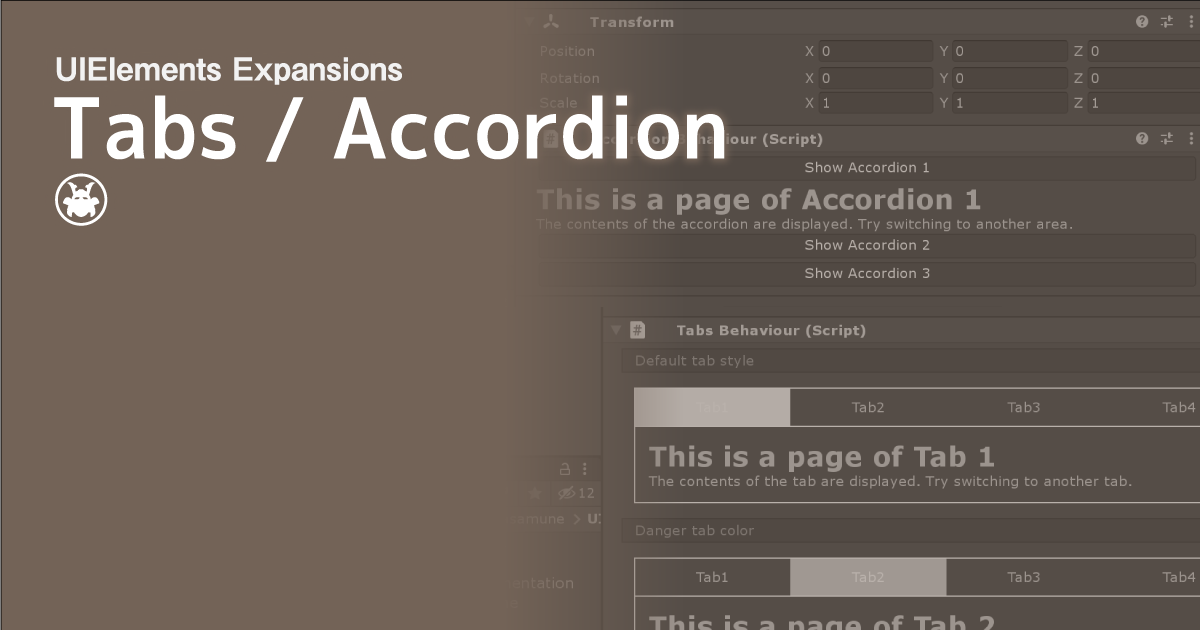
UIElements Expansions: Tabs / Accordion
"UIElements Expansions: Tabs / Accordion" strongly supports "UIElements" which was introduced with Unity 2019.1.
What is UIElements
UIElements replaces the current Unity editor GUI system (IMGUI) that was introduced in Unity 2019.1.
You can combine HTML for Unity "UXML" and style sheets for Unity "USS" to create a Unity GUI as if you were creating a web page with HTML and CSS.
Of course, you can write the process for the editor in the editor script as before, and you can create a dynamic GUI like HTML5 with methods like jQuery.
In the future, it is planned to replace the runtime GUI (Current uGUI) as well as the editor, and is expected to be the future Unity GUI.
However, the potential is high, but since it has just been introduced, there are still not enough functions to use it seriously.
"UIElements Expansions" is an asset that provides strong support for the missing pieces.
This "UIElements Expansions: Tabs / Accordion" mainly supports the following functions:
-
UIElements Expansions Common Features
- Global Style Sheet
- Inspector Auto Assign
- Additional Tags/Features
- Additional Class
- Tabs
- Accordion
UIElements Expansions Common Features
Please refer to the following page.
Tabs

"UIElements Expansions: Tabs / Accordion" adds tab and tab switching functionality to Unity and the Unity editor.
This can be done using the TabGroup and Tab tags, Instance tags, or " " routing features.
It is very easy to implement because you can switch tabs and page transitions by writing only UXML tags.
You can place tabs in the header like a web page or in the footer like an app.
Accordion

"UIElements Expansions: Tabs / Accordion" provides Unity and the Unity editor with the ability to toggle the display of the Accordion component.
An accordion is one of the UIs you see on web pages and apps.
Only the items are displayed beforehand. When you click on one of the items, the contents of that item will slide.
A component that, when you click another item, hides the contents of the previously displayed item and displays the new item you clicked.
It's called an accordion because it looks like it's playing an accordion.
"UIElements Expansions: Tabs / Accordion" provides this functionality through a combination of AccordionGroup and Accordion tags.
How to Use
Import

Purchase from Unity Asset Store.
You can import after purchase from "My Assets".
Tabs
Basic Usage
All you need to do is put a Tab tag under the TabGroup tag.
<engine:TabGroup>
  <engine:Tab text="Tab1" />
  <engine:Tab text="Tab2" />
  <engine:Tab text="Tab3" />
  <engine:Tab text="Tab4" />
</engine:TabGroup>
The example above has four tabs.
Tab behavior settings
In the first example, we just installed tabs. You must set an action on the Action tab.
The Tab tag inherits the Button tag and can be used to set actions like a Button or BindableButton.
To set from a script, set the event from the clickable property.
/// <summary>
/// Class Clickable Demo
/// </summary>
public class ClickableDemo : EditorWindow {
   ...
   private void OnEnable( ) {
      // Get tab element
      Tab tab = this.rootVisualElement.Q<Tab>();
      // Click processing added
      tab.clickable.clicked += () => {
          Something processing
      };
   }
   ...
}
You can also configure actions from within UXML like BindableButton.
<engine:Tab text="mathru.net" assembly="UnityEngine" type="Application" method="OpenURL" value="https://mathru.net" />The example above uses assembly, type, method, and value attributes to call static methods. Here we call Unity's Application.OpenURL and jump it to the external link.
Switch pages
When tabbing between pages, use a combination of Template and Instance.
<engine:Template path="Assets/Masamune/UIElements.Expansions.TabsAccordion/Assets/Styles/Articles/Tab1.uxml" name="Tab1" />
<engine:Template path="Assets/Masamune/UIElements.Expansions.TabsAccordion/Assets/Styles/Articles/Tab2.uxml" name="Tab2" />
<engine:Template path="Assets/Masamune/UIElements.Expansions.TabsAccordion/Assets/Styles/Articles/Tab3.uxml" name="Tab3" />
<engine:Template path="Assets/Masamune/UIElements.Expansions.TabsAccordion/Assets/Styles/Articles/Tab4.uxml" name="Tab4" />

<engine:TabGroup style="border-width:1px 1px 0;border-color:#fff;margin:10px 10px 0;" class="primary" >
  <engine:Tab text="Tab1" path="Tab1" target="main" active="true" />
  <engine:Tab text="Tab2" path="Tab2" target="main" />
  <engine:Tab text="Tab3" path="Tab3" target="main" />
  <engine:Tab text="Tab4" path="Tab4" target="main" />
</engine:TabGroup>

<engine:Instance template="Tab1" name="main" style="padding:10px;border-width:1px;border-color:#fff;margin: 0 10px 10px;overflow:hidden;" />
The external UXML file read by the Template tag can be displayed in the Instance tag by specifying the path and target attributes in the Tab tag as shown in the example above.
The path attribute specifies the name attribute of the loaded template, and the target attribute specifies the name attribute of the Instance tag to display.
Set Initial Position
You can select the initially active tab by setting the active attribute of the Tab tag to true.
<engine:Tab text="Tab1" path="Tab1" target="main" active="true" />Design Settings
TabGroup and Tab tags can set additional color classes common to the "UIElements Expansions" series.
<engine:TabGroup class="danger">
  <engine:Tab text="Tab1" path="Tab1" target="main" active="true" />
  <engine:Tab text="Tab2" path="Tab2" target="main" />
  <engine:Tab text="Tab3" path="Tab3" target="main" />
  <engine:Tab text="Tab4" path="Tab4" target="main" />
</engine:TabGroup>
In the example above, the active color of the tab is red.
You can also use the underline class for tabs. The underline class does not change all the colors of the background, but instead displays colored bars under the tabs. Please use it with color class.
<engine:TabGroup class="primary underline">
  <engine:Tab text="Tab1" path="Tab1" target="main" active="true" />
  <engine:Tab text="Tab2" path="Tab2" target="main" />
  <engine:Tab text="Tab3" path="Tab3" target="main" />
  <engine:Tab text="Tab4" path="Tab4" target="main" />
</engine:TabGroup>
It also supports Masamune Framework's IconFont and Localzie tags, which allow you to use the IconTab and LocalizeTab tags. They can be used separately for icon display and translation application.
<engine:TabGroup class="primary underline">
  <engine:IconTab icon="fa-user" path="Tab1" target="main" active="true" />
  <engine:LocalizeTab text="Localization key" path="Tab2" target="main" />
  <engine:Tab text="Tab3" path="Tab3" target="main" />
  <engine:Tab text="Tab4" path="Tab4" target="main" />
</engine:TabGroup>
Accordion
Basic Usage
Basically, the Accordion tag is placed under the AccordionGroup tag.
<engine:AccordionGroup>
  <engine:Accordion name="accordion1">
    Accordion Contents
  </engine:Accordion>
  <engine:Accordion name="accordion2">
    Accordion Contents
  </engine:Accordion>
</engine:AccordionGroup>
Like VisualElement tags, Accordion tags can contain UXML tags, each of which describes the content that you want to display.
Toggle Accordion
You can toggle the accordion using the BindableButton (or a derived tag, such as BindableIconButton or BindableLocalizeButton).
<engine:AccordionGroup>
  <editor:BindableButton text="Show Accordion 1" control="show" target="accordion1" />
  <engine:Accordion name="accordion1">
    Accordion Contents
  </engine:Accordion>
  <editor:BindableButton text="Show Accordion 2" control="show" target="accordion2" />
  <engine:Accordion name="accordion2">
    Accordion Contents
  </engine:Accordion>
</engine:AccordionGroup>
You control the accordion by specifying the BindableButton's control and target attributes, respectively. The control attribute is show, and the target attribute is the name attribute of the accordion you want to display. This displays the accordion for the specified target.
Using Templates
An Accordion tag can use a template to display another UXML file as content.
<engine:Template path="Assets/Masamune/UIElements.Expansions.TabsAccordion/Assets/Styles/Articles/Accordion3.uxml" name="Accordion3" />
<engine:Template path="Assets/Masamune/UIElements.Expansions.TabsAccordion/Assets/Styles/Articles/Accordion4.uxml" name="Accordion4" />

<engine:AccordionGroup>
  <editor:BindableButton text="Show Accordion 3" control="show" target="accordion3" />
  <engine:Accordion name="accordion3" template="Accordion3" />
  <editor:BindableButton text="Show Accordion 4" control="show" target="accordion4" />
  <engine:Accordion name="accordion4" template="Accordion4" />
</engine:AccordionGroup>
The Template tag specifies an external UXML file and the template attribute of the Accordion tag specifies the name attribute.
Summary
"UIElements Expansions: Tabs / Accordion" strongly supports "UIElements" which was introduced with Unity 2019.1. In particular, it makes it easier to write inspector designs that previously required editor scripts.
You can also use tabs and accordions to build a more intuitive UI. You will be able to use it extensively in manuals and tutorials.
The design has been flattened to match Unity 2019.3, which is cool at once, so you can use it comfortably.
If you are interested, please check out the asset store!