UIElements Expansions is an extended asset for the Unity editor.
UIElements Expansions
The "UIElements Expansions" series provides strong support for the "UIElements" introduced in Unity 2019.1.
What is UIElements
UIElements replaces the current Unity editor GUI system (IMGUI) that was introduced in Unity 2019.1.
You can combine HTML for Unity "UXML" and style sheets for Unity "USS" to create a Unity GUI as if you were creating a web page with HTML and CSS.
Of course, you can write the process for the editor in the editor script as before, and you can create a dynamic GUI like HTML5 with methods like jQuery.
In the future, it is planned to replace the runtime GUI (Current uGUI) as well as the editor, and is expected to be the future Unity GUI.
However, the potential is high, but since it has just been introduced, there are still not enough functions to use it seriously.
"UIElements Expansions" is an asset that provides strong support for the missing pieces.
Currently, the "UIElements Expansions" series mainly distributes the following assets.
These assets share some common features.
- Global Style Sheet
- Inspector Auto Assign
- Additional Tags/Features
- Additional Class
Global Style Sheet

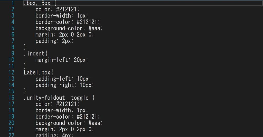
The CSS from which USS originated normally creates one or more common files and loads them together in an HTML header.
Global style sheets can be used in a similar way to CSS.
Inspector Auto Assign

Unity allows you to rewrite any GUI of the inspector, such as components and scriptable objects. However, you must write your own editor script for the component.
It is now possible to write a configuration in UXML like HTML, but it is a little troublesome to write an editor script to assign the created UXML to which component.
"Inspector Auto Assign" will automatically determine which component to use based on the UXML file name without writing an editor script and assign it automatically.
Additional Tags/Features
UIElements lets you add your own UXML tags for styling and functionality. UIElements Expansions supports the use of UIElements by adding several useful tags.
The currently added UXML tags are:
-
Div
- Alias for VisualElement. There is no special function, and it is used to specify USS.
-
Header、Footer、Main、Article
- Alias for VisualElement. There is no special function, and it is used to specify USS.
-
H1~H6
- Alias for Label. There is no special function, and it is used to specify USS.
-
BindableImage
- You can retrieve and display images from serialized properties. You can also use an external URL (http://~).
-
BindableButton
- Button for Editor only. You can specify the execution of a static method without writing a script by specifying the method name or value from the UXML. It can also be combined with a template to switch between templates.
-
BindableLabel、BindableH1~H6
- You can display serialized string variables as labels.
-
BindableListView
- Alias for PropertyField array/List only. Optimized for USS specification in array/List.
Additional Class
UIElements designs using its own USS class. The "UIElements Expansions" series provides several useful classes to support USS design.
-
Color Class
- Color classes are available for different states.
-
Button Class
- Change the button design.
How to use
Import
Please purchase one of the following "UIElements Expansions" series.
The features described in this article are available throughout the "UIElements Expansions" series.
You can import after purchase from "My Assets".
Global Style Sheet
You can use it as it is.
Change Style

Edit "PersonalStyle" and "ProStyle" in the "Assets/Masamune/Modules/unity.style/Styles" folder.
Normally "PersonalStyle", if you are using the Proskin (black-based skin) available in Unity Pro/Plus, you can edit the "ProStyle" to instantly reflect the skin.
Use your own style sheet

Select "EditorStyleInfo" in the "Assets/Masamune/Modules/unity.style/Resources" folder. The edit screen appears in the inspector.
Open the "StyleSheet Settings" tab and you should see a list of "Style Sheets" and "Style Sheets For Pro Skin". It specifies the style files for regular and proskinned editors, respectively.
You can add style files from here. The lower the priority, so change the order as necessary.
Inspector Auto Assign
You can apply uxml to the inspector screen of the created class by creating a uxml file with the same name as the class that inherits "MonoBehaviour" or "ScriptableObject".
Examples
Create a "MyMonoScript" that inherits "MonoBehaviour".
// MyMonoScript.cs
public class MyMonoScript : MonoBehaviour {
  public string name;
  public int age;
  ...
}
Create the same uxml file called "MyMonoScript". (Anywhere under the Assets folder is OK)
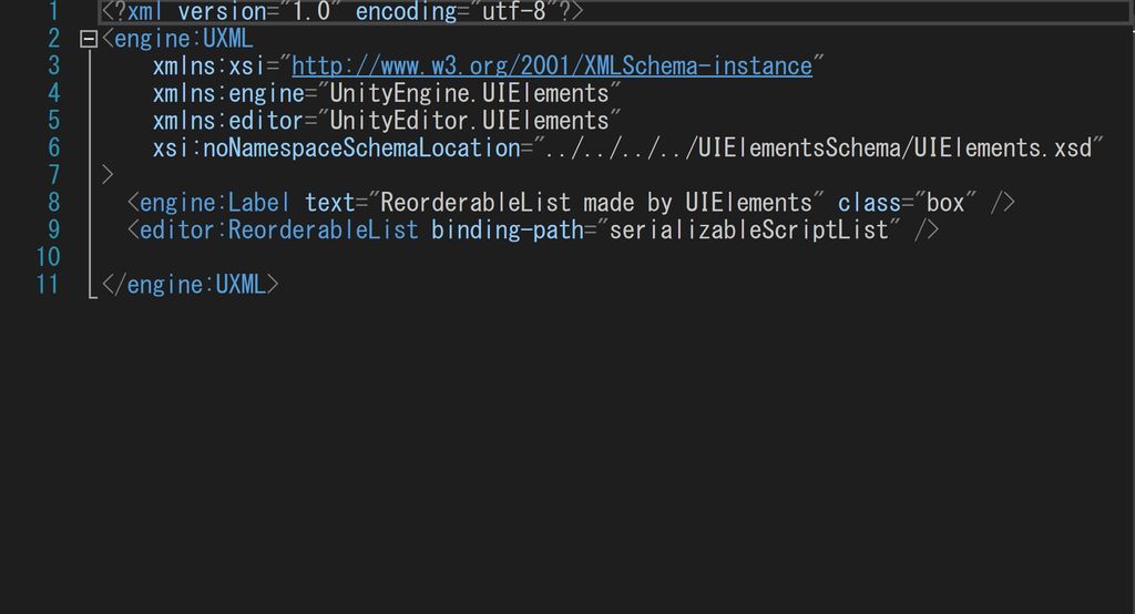
<?xml version="1.0" encoding="utf-8"?>
<engine:UXML
    xmlns:xsi="http://www.w3.org/2001/XMLSchema-instance"
    xmlns:engine="UnityEngine.UIElements"
    xmlns:editor="UnityEditor.UIElements"
    xsi:noNamespaceSchemaLocation="../../../../UIElementsSchema/UIElements.xsd"
>
  <editor:PropertyField binding-path="name" class="box" />
  <editor:PropertyField binding-path="age" class="box" />
</engine:UXML>
The Inspector screen now appears with the UIElements style applied.
Use outside MonoBehaviour and ScriptableObject
If you want to use this feature in "MonoBehaviour" or "ScriptableObject", such as custom classes in Lists or arrays, you can do so by extending "SerializableBehaviour".
The usage is to create a class "MySerializable" that inherits "SerializableBehaviour" as well as "MonoBehaviour" and "ScriptableObject" inheritance classes. Since your own class must specify that it can be serialized, you give it the [System.Serializable] attribute.
// MySerializable.cs
[System.Serializable]
public class MySerializable : SerializableBehaviour {
  public string name;
  public int age;
  ...
}
Create a similar uxml file called "MySerializable".
// MySerializable.uxml
<?xml version="1.0" encoding="utf-8"?>
<engine:UXML
    xmlns:xsi="http://www.w3.org/2001/XMLSchema-instance"
    xmlns:engine="UnityEngine.UIElements"
    xmlns:editor="UnityEditor.UIElements"
    xsi:noNamespaceSchemaLocation="../../../../UIElementsSchema/UIElements.xsd"
>
  <editor:PropertyField binding-path="name" class="box" />
  <editor:PropertyField binding-path="age" class="box" />
</engine:UXML>
The "MySerializable" class now appears in the inspector with UIElements applied.
Using with editor scripts
You may have already written an editor script. If an editor script modifies the inspector screen for a particular class, the editor script you create takes precedence.
Additional Tags/Features
Div
The "Div" tag is an alias for "VisualElement". It provides the same functionality as VisualElement.
<engine:Div>
  Other UXML tags
</engine:Div>
Header、Footer、Main、Article
"Header" "Footer" "Main" "Article" The tag is an alias for "VisualElement". It provides the same functionality as VisualElement.
<engine:Header>
  Other UXML tags
</engine:Header>
H1~H6
"H1" "H2" "H3" "H4" "H5" "H6" The tag is an alias for "Label". You can use the same functions as Label.
A tag added for the title with a pre-applied USS class for the title.
<engine:H1 text="Largest title" />
<engine:H2 text="Second largest title" />
<engine:H3 text="3rd largest title" />
BindableImage
"BindableImage" is an Editor-specific tag that extends the "Image" tag. In addition to the Image functionality, there are several other features available.
Displaying external URL images
You can load and display an image of an external URL by using the "src" attribute.
<editor:BindableImage src="External URL" />Note that images are not displayed when you are not connected to the Internet or cannot access an external URL.
Reading from Serialized Variables
The "binding-path" attribute allows you to read the serialized value in the same way as "PropertyField".
<editor:Image binding-path="Serialized variable name" />BindableButton
"BindableButton" is an Editor-specific tag that extends the "Button" tag. In addition to the Button's features, there are several other features.
Specifying Method Execution
You can specify "Assembly name (Optional)" "Type name (namespace incorporation)" "Method name" to specify the method execution when the button is pressed from within the UXML.
<editor:BindableButton class="list" text="Beep" assembly="UnityEditor" type="UnityEditor.EditorApplication" method="Beep" />You can also pass values to methods whose arguments are strings by specifying the "value" attribute.
<editor:BindableButton class="list" text="mathru.net" assembly="UnityEngine" type="Application" method="OpenURL" value="https://mathru.net" />Toggle Template
It can also be combined with the "Template" tag to switch templates in the UXML.
<engine:Template path="Assets/Masamune/UIElements.Expansions.ResponsiveGrid/Assets/Styles/Articles/About.uxml" name="About" />
<engine:Template path="Assets/Masamune/UIElements.Expansions.ResponsiveGrid/Assets/Styles/Articles/ResponsiveGrid.uxml" name="ResponsiveGrid" />
<engine:Template path="Assets/Masamune/UIElements.Expansions.ResponsiveGrid/Assets/Styles/Articles/ReorderableList.uxml" name="ReorderableList" />
<engine:Template path="Assets/Masamune/UIElements.Expansions.ResponsiveGrid/Assets/Styles/Articles/Card.uxml" name="Card" />

<engine:Instance template="About" name="main">
</engine:Instance>

<editor:BindableButton text="About" path="About" target="main" />
<editor:BindableButton text="Reorderable List" path="ReorderableList" target="main" />
<editor:BindableButton text="Responsive Grid" path="ResponsiveGrid" target="main" />
<editor:BindableButton class="list" text="CardView / CardList" path="Card" target="main" />
In the above example, the contents of About.uxml will first appear in [name="main"]. By clicking each button, the template named in the "path" attribute is reflected in the location named in the "target" attribute, that is, the contents of the [name="main"].
BindableLabel、BindableH1~H6
"BindableLabel" "BindableH1~H6" is an Editor-specific tag that extends the Label tag. In addition to the Label functionality, there are a few other features.
Reading from Serialized Variables
The "binding-path" attribute allows you to read the serialized value in the same way as "PropertyField".
<editor:BindableLabel binding-path="Serialized variable name" />
<editor:BindableH1 binding-path="Serialized variable name" />
<editor:BindableH2 binding-path="Serialized variable name" />
<editor:BindableH3 binding-path="Serialized variable name" />
BindableListView
"BindableListView" is Editor specific tag with "PropertyField" tag optimized for array/List. The classpath for PropertyField has changed.
"BindableListView" checks each child element of the array, and places the VisualElement which attached the "unity-listview-field__content" class outside of each child element when the child element is in the following condition:
- Child element is not an array/List
- Child element does not have PropertyDrawer set
This allows arrays to be classified into single and multiple elements, and USS can be specified such that only single elements are boxed.
// Enclose only a single element
BindableListView .unity-listview-field__content {
    margin: 2px 0 2px 0;
    padding: 2px;
    color: #888;
    border-width: 1px;
    border-color: #212121;
    background-color: #2f2f2f;
}
Additional Class
Color Class
Each color can be used in a particular tag by adding the following color classes to the class attribute:
| Class Name | Color Code |
|---|---|
| primary | #4285F4 |
| secondary | #AA66CC |
| info | #33B5E5 |
| success | #00C851 |
| warning | #FF8800 |
| danger | #CC0000 |
If you specify a color class, such as Modal or Button, the colors are changed.
<engine:Button class="warning" text="Warning Button" />Button Class
You can change the style of a button by using the following button classes:. Please use this together with the above color classes.
| Class Name | Detail |
|---|---|
| outline | Button style with outlined |
You can use it with Button and BindableButton.
<editor:BindableButton class="warning outline" text="Outlined Warning Button" />Summary
The "UIElements Expansions" series provides strong support for the "UIElements" introduced in Unity 2019.1. In particular, it makes it easier to write inspector designs that previously required editor scripts.
The design has been flattened to match Unity 2019.3, which is cool at once, so you can use it comfortably.
If you are interested, please check out the asset store!
![[Unity] UIElements Expansions - mathru.net | App Development with Flutter, Unity/Music and Video Production/Material Distribution](https://mathru.net/notion/c5232666-d89a-46bb-93d2-b4b2de69bbec/1bcdffd502f7e496966b76f63e8d738c-large.png)
