![[Unity] UIElements Expansions: Carousel - mathru.net | App Development with Flutter, Unity/Music and Video Production/Material Distribution](https://mathru.net/notion/f77ceacd-b222-4c29-9da3-6a1d500228cd/8ea680a53879db07e2fe18a6f2f07924-large.webp)
UIElements Expansions is an extended asset for the Unity editor.
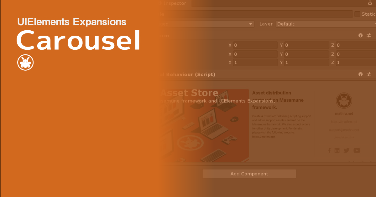
UIElements Expansions: Carousel
"UIElements Expansions: Carousel" strongly supports "UIElements" which was introduced with Unity 2019.1.
What is UIElements
UIElements replaces the current Unity editor GUI system (IMGUI) that was introduced in Unity 2019.1.
You can combine HTML for Unity "UXML" and style sheets for Unity "USS" to create a Unity GUI as if you were creating a web page with HTML and CSS.
Of course, you can write the process for the editor in the editor script as before, and you can create a dynamic GUI like HTML5 with methods like jQuery.
In the future, it is planned to replace the runtime GUI (Current uGUI) as well as the editor, and is expected to be the future Unity GUI.
However, the potential is high, but since it has just been introduced, there are still not enough functions to use it seriously.
"UIElements Expansions" is an asset that provides strong support for the missing pieces.
This "UIElements Expansions: Carousel" mainly supports the following functions:
-
UIElements Expansions Common Features
- Global Style Sheet
- Inspector Auto Assign
- Additional Tags/Features
- Additional Class
- Carousel
- Carousel control button
UIElements Expansions Common Features
Please refer to the following page.
Carousel

You can place a component called a carousel in "UIElements Expansion: Carousel".
A carousel is a common component in the Web that periodically switches images and content.
You can place it at the top of the site to better position the content you want to feature in the site.
In addition to images, you can place UXML tags freely within the asset, allowing you to view a variety of content in sequence.
Of course it looks best in the editor window, but you can also associate it with MonoBehaviour or ScriptableObject to display it in the inspector, depending on your usage.
Carousel control button

In addition to positioning the carousel, "UIElements Expansion: Carousel" allows you to control the display with buttons.
You can not only switch automatically by placing the Next and Previous buttons, but you can also switch the contents of the carousel manually.
How to Use
Import

Purchase from Unity Asset Store.
You can import after purchase from "My Assets".
Carousel
Basic usage
Carousel uses a combination of "engine:CarouselGroup" and "engine:Carousel".
Placing multiple "engine:Carousel" under "engine:CarouselGroup" and placing your favorite UXML tags in "engine:Carousel" allows you to swap the elements of each UXML enclosed in "engine:Carousel".
<engine:CarouselGroup name="carouselgroup">
  <engine:Carousel name="carousel1">
    Carousel Contents
  </engine:Carousel>
  <engine:Carousel name="carousel2">
    Carousel Contents
  </engine:Carousel>
</engine:CarouselGroup>
Automatic play
In the above code, the carousel element does not move. If you want to automatically replace each element, you need to set the attribute of "autoplay" to "true" in "engine:CarouselGroup".
<engine:CarouselGroup autoplay="true" time="5000" name="carouselgroup">
  <engine:Carousel name="carousel1">
    Carousel Contents
  </engine:Carousel>
  <engine:Carousel name="carousel2">
    Carousel Contents
  </engine:Carousel>
</engine:CarouselGroup>
The "time" attribute allows you to specify how long to wait for each element to display.
Carousel control button
You can control the carousel with "BindableButton".
Previous / Next
For the "Previous" and "Next" buttons, specify the name of "engine:CarouselGroup" in the "target" attribute of "BindableButton" and "prev" or "next" in the "control" attribute.
<editor:BindableButton text="Prev" target="carouselgroup" control="prev" />
<editor:BindableButton text="Next" target="carouselgroup" control="next" />"prev" moves the element in the carousel to the previous position, and "next" moves the element to the next position.
Display the specified carousel element
You can display a specific carousel element directly by specifying the name of a "engine: Carousel" in the "target" attribute of "BindableButton" and "show" in the "control" attribute.
<editor:BindableButton text="Show Carousel 2" target="carousel2" control="show" />If "autoplay" is enabled for the carousel, the specified element is displayed, the next element is automatically displayed after a period of time.
Summary
"UIElements Expansions: Carousel" strongly supports "UIElements" which was introduced with Unity 2019.1. In particular, it makes it easier to write inspector designs that previously required editor scripts.
Carousel also allows you to display content in editor windows and inspectors that will catch your eye.
The design has been flattened to match Unity 2019.3, which is cool at once, so you can use it comfortably.
If you are interested, please check out the asset store!