![[Unity] UIElements Expansions: Modal - mathru.net | App Development with Flutter, Unity/Music and Video Production/Material Distribution](https://mathru.net/notion/339c10b7-739a-4e40-8aa9-eae0d73f4985/4ceee82df0c01d3509b228b3cded83cd-large.webp)
UIElements Expansions is an extended asset for the Unity editor.
UIElements Expansions: Modal
"UIElements Expansions: Modal" strongly supports "UIElements" which was introduced with Unity 2019.1.
What is UIElements
UIElements replaces the current Unity editor GUI system (IMGUI) that was introduced in Unity 2019.1.
You can combine HTML for Unity "UXML" and style sheets for Unity "USS" to create a Unity GUI as if you were creating a web page with HTML and CSS.
Of course, you can write the process for the editor in the editor script as before, and you can create a dynamic GUI like HTML5 with methods like jQuery.
In the future, it is planned to replace the runtime GUI (Current uGUI) as well as the editor, and is expected to be the future Unity GUI.
However, the potential is high, but since it has just been introduced, there are still not enough functions to use it seriously.
"UIElements Expansions" is an asset that provides strong support for the missing pieces.
This "UIElements Expansions: Modal" mainly supports the following functions:
-
UIElements Expansions Common Features
- Global Style Sheet
- Inspector Auto Assign
- Additional Tags/Features
- Additional Class
- Modal function
UIElements Expansions Common Features
Please refer to the following page.
Modal function

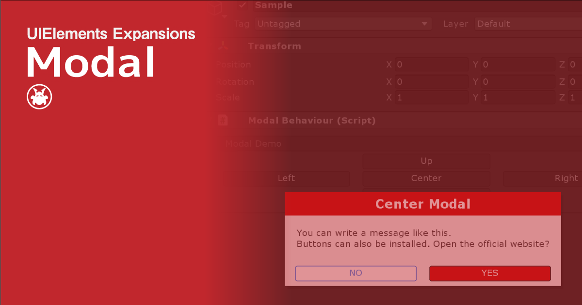
In "UIElements Expansions: Modal", you can display "Modal" such as dialogs and pop-up bars.
While modal is displayed, other elements of the window are blacked out and cannot be touched, so they can be used for "Confirmation window" and "Show Warnings" after some action.
You can also change the vertical, horizontal, center, and modal display positions. The display position does not need to be set in the USS file and can be easily changed in the tag attribute of UXML.
The modal display animates like a modern website. You can also change the animation time.
The modal visibility toggle can be easily specified with buttons in the UIElements Expansions series such as "BindableButton". It's also scriptable, so you can start up any modal in any scene.
Modal contents can be freely designed using UXML tags and USS. You can directly nest the design in Modal tags, or you can use templates to describe the design in an external file.
How to Use
Import

Purchase from Unity Asset Store.
You can import after purchase from "My Assets".
Modal function
Basic Usage
To use Modal, all you need to do is write a Modal tag directly below the UXML tag and include a modal design in it.
<editor:Modal>
  Modal Content
</editor:Modal>
The modal design used in the demo is described below.
<editor:Modal name="center" class="info">
  <engine:H1 text="Center Modal" />
  <engine:Main>
    <engine:Label text="You can write a message like this." />
    <engine:Label text="Buttons can also be installed. Open the official website?" />
  </engine:Main>
  <engine:Footer class="row">
    <engine:Div class="col-6">
      <editor:BindableButton text="NO" class="primary outline" control="hide" target="center" />
    </engine:Div>
    <engine:Div class="col-6">
      <editor:BindableButton text="YES" class="warning" control="hide" target="center" assembly="UnityEngine" type="Application" method="OpenURL" value="https://mathru.net" />
    </engine:Div>
  </engine:Footer>
</editor:Modal>
Specify Location
The editor:Modal tag can have a "area" attribute to specify where the modal is displayed.
<!-- Upper Modal -->
<editor:Modal name="up" area="top" class="info">
  <engine:H1 text="Upper Modal" />
</editor:Modal>
<!-- Downer Modal -->
<editor:Modal name="down" area="bottom" class="info">
  <engine:H1 text="Downer Modal" />
</editor:Modal>
<!-- Left Modal -->
<editor:Modal name="left" area="left" class="info">
  <engine:H1 text="Left Modal" />
</editor:Modal>
<!-- Right Modal -->
<editor:Modal name="right" area="right" class="info">
  <engine:H1 text="Right Modal" />
</editor:Modal>
<!-- Center Modal -->
<editor:Modal name="center" area="center" class="info">
  <engine:H1 text="Center Modal" />
</editor:Modal>
Set Animation Time
You can set the modal animation time by attaching the attribute "time" to the editor:Modal tag. Set in milliseconds.
<!-- 500ms animation time -->
<editor:Modal name="center" time="500" class="info">
  <engine:H1 text="Center Modal" />
</editor:Modal>
Color classes available
You can use color classes to change modal colors.
<!-- Warning modal -->
<editor:Modal name="center" class="warning">
  <engine:H1 text="Warning Modal" />
</editor:Modal>
Show/Hide Modal
Control from BindableButton
The control and target attributes of the BindableButton control the visibility of Modal when the button is clicked.
The control attribute contains the name of the modal control command, and the target attribute contains the name of the modal control command.
<editor:BindableButton text="Show modal" control="show" target="center" />

<editor:Modal name="center" time="500" class="info">
  <engine:H1 text="Center Modal" />
</editor:Modal>
The following commands can be specified in the control attribute.
| Command | Detail |
| show | Show Modal |
| hide | Hide Modal |
| toggle | Toggle modal visibility(Hide when modal is visible, Show when modal is hidden) |
Controlling from scripts
You can control the modal state from a script.
public class ModalDemo : EditorWindow {
   ...
   // Show Modal
   public void Show( ) {
       // Get Modal From Root
       Modal modal = rootVisualElement.QRoot<Modal>();
       if( modal != null ) modal.Show( );
   }
   // Hide Modal
   public void Hide( ) {
       // Get Modal From Root
       Modal modal = rootVisualElement.QRoot<Modal>();
       if( modal != null ) modal.Hide( );
   }
   // Toggle Modal
   public void Toggle( ) {
       // Get Modal From Root
       Modal modal = rootVisualElement.QRoot<Modal>();
       // Animation time can be passed as an argument
       if( modal != null ) modal.Toggle( 500 );
   }
   ...
}
Summary
"UIElements Expansions: Modal" strongly supports "UIElements" which was introduced with Unity 2019.1. In particular, it makes it easier to write inspector designs that previously required editor scripts.
Modal can be used to create more user-friendly GUIs.
The design has been flattened to match Unity 2019.3, which is cool at once, so you can use it comfortably.
If you are interested, please check out the asset store!